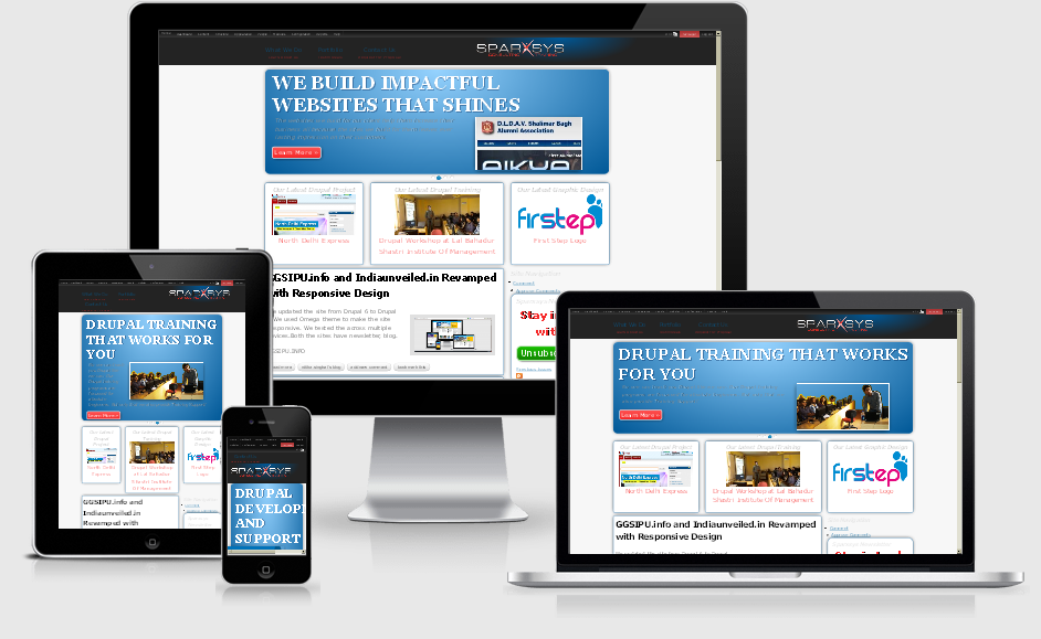
For the past few months I was working on revamping this site. There was nothing wrong with the old site and design but I just felt that I should do something different. On of the biggest reason for this revamp is the use of Omega Theme which I really find amazing theme. Not only it is responsive but it also offers lot of regions to put your content. Not only that you can also create more regions with as ease. Just an awesome theme it is and I just wanted to use it on this site. We at Sparxsys are now diving into Responsive Designs so we should have our official site responsive I guess :) I am sure somethings are not perfect right now with the design but we are not afraid of using anything new. Many people are nowadays using Mobile devices, Tabs for browsing internet and for other web based applications so why not have a responsive design. I am going to work more on this site design in coming weeks. This is like our own laboratory for testing new stuff. If you are reading this blog or have reached this site by searching on google just resize your window and see the magic yourself. Especially on the home page you will notice that the site blocks will adjust automatically as you start decreasing the width of the window. If you decrease it too further then the block will arrange themselves vertically. Also the slider on the home page is responsive. It should resize the image automatically as per the screen size. It doesn't work well all the time but I will figure out something to fix that. You can also check our other website www.slahnode.in which is free resource for Drupal learning. The responsiveness of the design is more prominent there. That site also used Omega Theme. On slashnode.in we will be posting tutorial and will create videos to teach you how to create your own responsive site in Drupal.